Lonely Planet
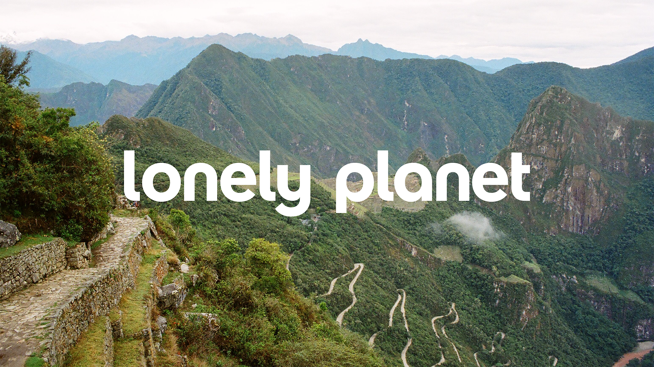
G.E.O. was tasked with redesigning the beloved, generations-spanning brand, Lonely Planet. We were asked to breathe new life into the travel companion and help it connect to a whole new generation of explorers as well as longtime fans and users.
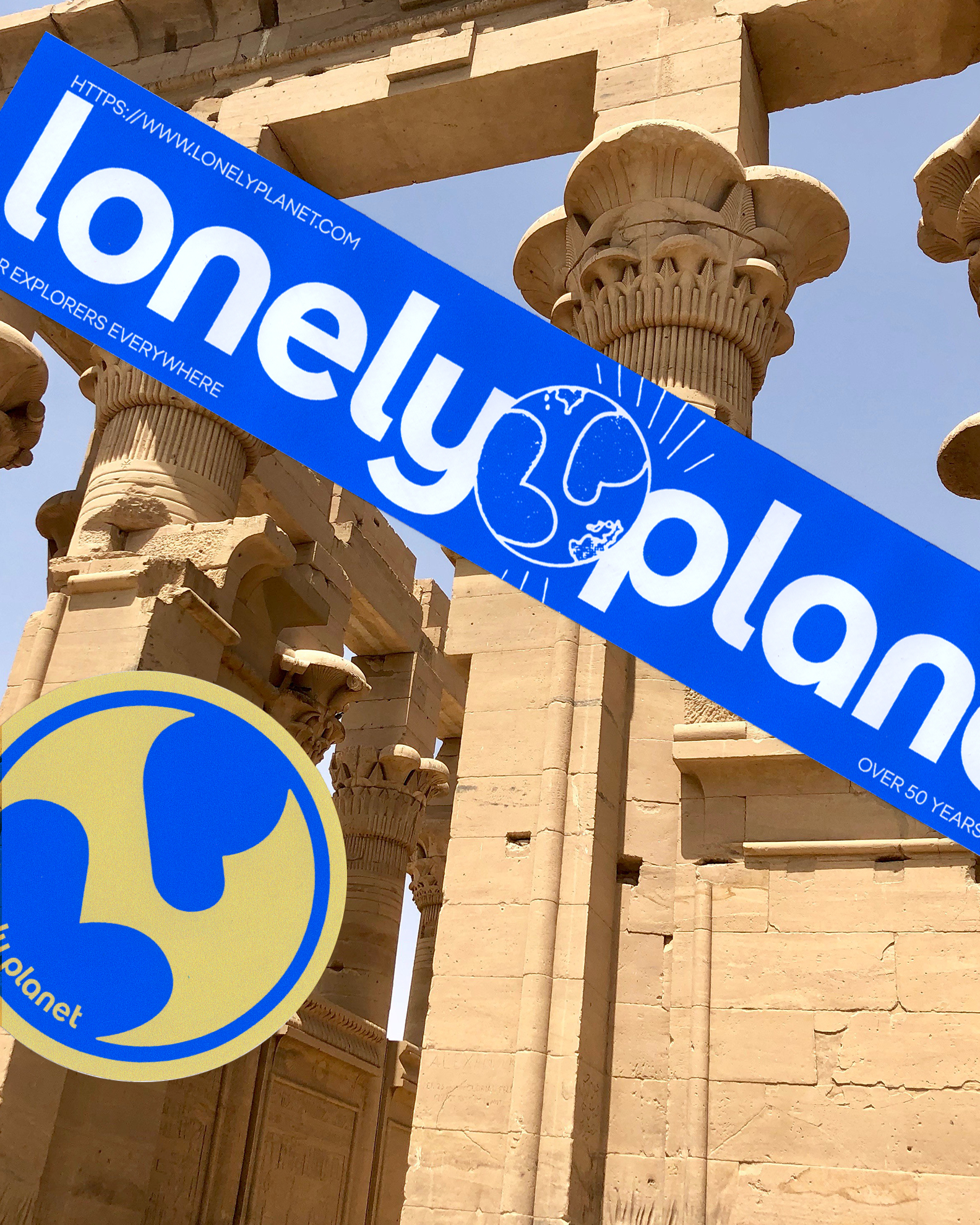
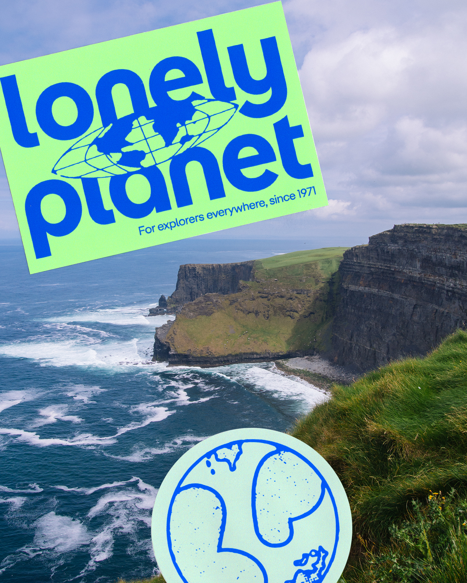
While we may have eliminated the recognizable circular shapes from the primary logo, we found a new home and new life for it with the brand’s secondary mark: the LP sits in a holding shape referencing the original logo, and aims to mimic continents on a globe.
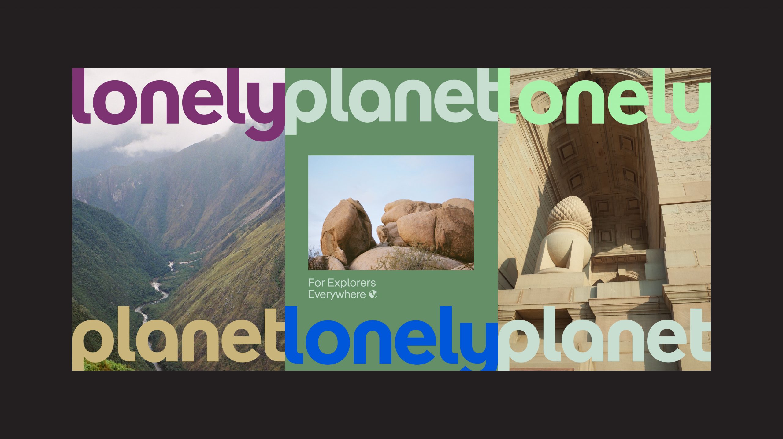
The work also spanned updating the art direction of hero photography to feel a bit more artistic and less stock. We also evolved the brand palette beyond the iconic blue.

Presenting the final redesign to a very large, very global team on zoom 🙂